Context
Opera speaks across home, office, fitness, product education, and promotion. The challenge was to keep every message fresh without letting the brand feel fragmented.

Brand communication · Mineral water
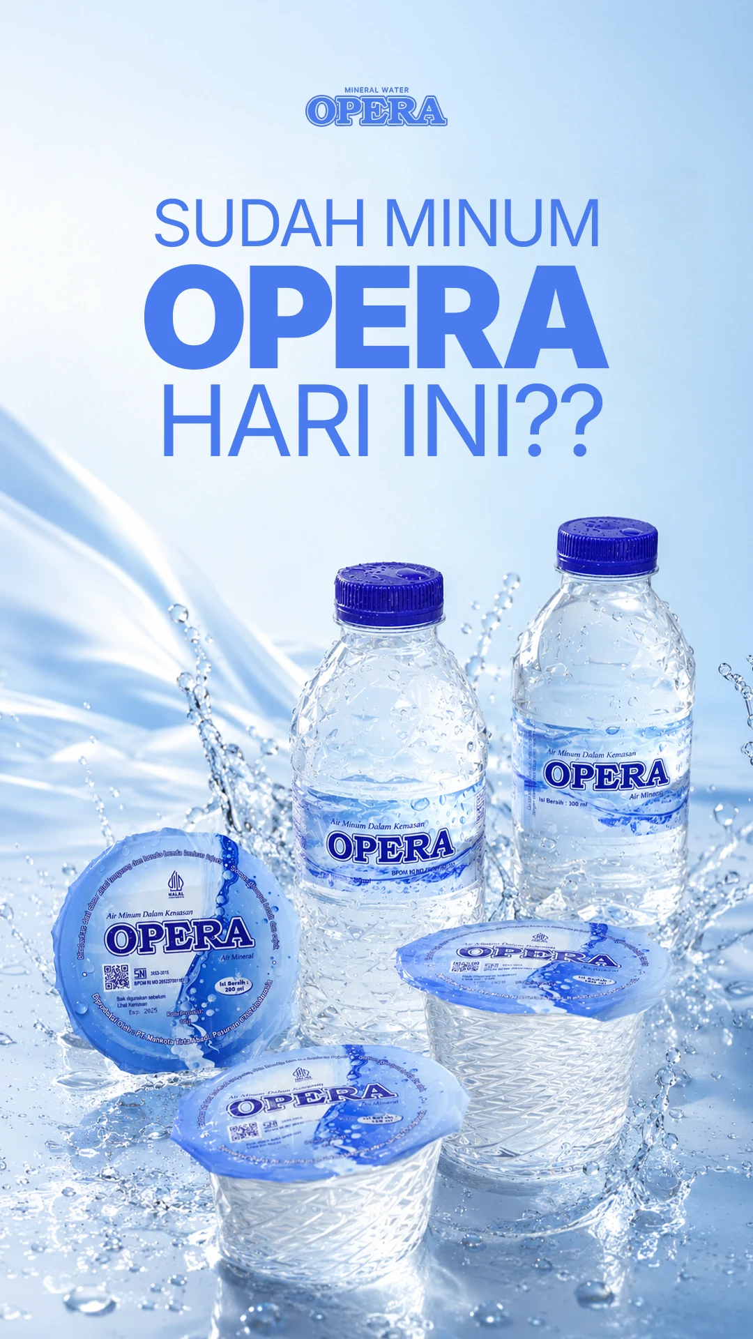
A bright visual language for product, lifestyle, and promotion. Water has enough to do without a complicated introduction.

Project overview
Opera speaks across home, office, fitness, product education, and promotion. The challenge was to keep every message fresh without letting the brand feel fragmented.
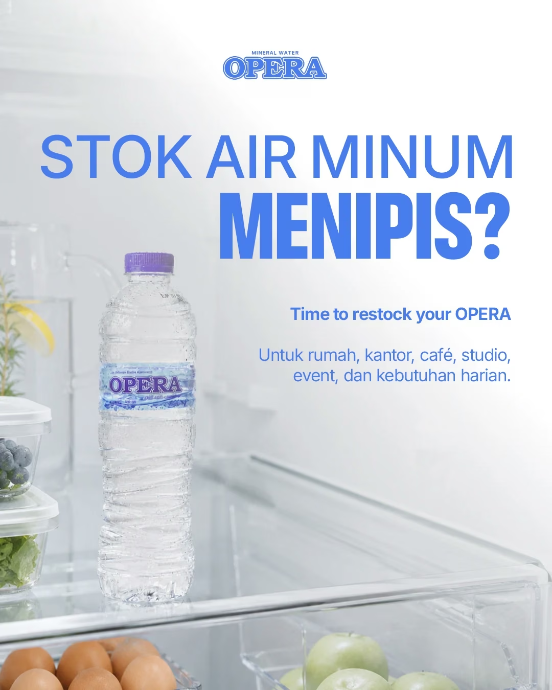
Soft gradients, bright white space, bold blue typography, and product-led compositions create a system that feels light, clear, and unmistakably Opera.
02 / Product communication
The product range uses clear hierarchy and generous space so bottles, formats, and key information are easy to compare.


03 / Product Catalog Design
Campaign direction · Social content · Product catalog
04 / Lifestyle direction
From active routines to quieter moments, the bottle stays familiar while the setting changes.


05 / Story formats
Vertical compositions give each product message room to register at a glance, in the format where it actually appears.


06 / Promotional campaign
Teaser, offer information, and call to action form a sequence with a clear next step at every point.


07 / Outcome
Product information, everyday scenes, and promotion share the same blue-and-white language while keeping their own purpose.